Stock K-Line Charts
Stock K-Line ChartsPosted by Ravish Kumar on 16-09-2026
On Trend
Hi, Readers! If you've ever looked at a stock chart and felt a little overwhelmed by all those colorful little bars going up and down, you're definitely not alone.
Those bars are called candlestick charts, or K-line charts, and once you understand them, they start to feel like a friendly map through the sometimes confusing world of investing. So, do they actually mean anything? Absolutely, and let's walk through this together.
A Tool With Deep Roots
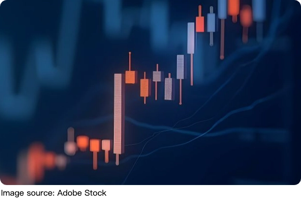
Candlestick charts have been around since the 1700s, when a Japanese trader named Homma invented them. He realized there was a link between price, supply and demand, and traders' emotions. He developed a chart where each candlestick represented four key dimensions of a trading period: the open, the high, the close, and the low. It's kind of amazing to think that a tool this old is still one of the most trusted ways traders read the market today.
What Each Candle Actually Shows You
Candlestick charts are a visual aid for decision-making in stock, foreign exchange, commodity, and option trading. By looking at a candlestick, one can identify an asset's opening and closing prices, highs and lows, and overall range for a specific time frame. Think of it like a snapshot of how a trading session went. A bullish candle forms when the closing price is higher than the opening price, meaning buyers were in control during that period, pushing the price up. Bullish candles are traditionally colored green or hollow. On the flip side, a bearish candle forms when the closing price is lower than the opening price, meaning sellers were in control and drove the price down. Bearish candles are traditionally colored red or filled.
The wicks, also called tails or shadows, are the long thin lines above and below the main body, and they reveal the intra-day high and low. So even the little lines carry real meaning. Every tiny part of a candle is telling you something about what buyers and sellers were doing during that session.
Reading Pressure and Momentum
Generally speaking, the longer the body is, the more intense the buying or selling pressure. Conversely, short candlesticks indicate little price movement and represent consolidation. This is such a helpful way to understand the mood of the market at a glance. Investors' emotions drive a lot of what happens with stock prices and trade movements. While emotion can't be measured directly, candlestick charts help traders see trends, assess emotional patterns, and make predictions about future prices.
A doji candle, for example, conveys a sense of indecision between buyers and sellers. Prices move above and below the opening level during the session but close at or near it. The result is a standoff. Neither side was able to gain control, and a turning point could be developing.
Expert Insight: Context Matters
Steve Nison, widely known for introducing Japanese candlestick charting techniques to Western audiences, emphasizes that individual candlestick patterns should be interpreted within the broader market context.
A candle can reveal how buyers and sellers interacted during a particular period. Still, its significance depends on factors such as the preceding trend, nearby support and resistance levels, and confirmation from subsequent price action. This is why traders generally look beyond a single candle before concluding where prices may move next.
Best Used Alongside Other Tools
Here's something really important to keep in mind: candlestick charts are powerful, but they work best as part of a bigger picture. Candlestick charts have merits as a charting system, but they also confirm signals generated by other technical analysis tools. One limitation of using candlestick patterns alone is that they do not provide potential price targets. However, this can be achieved by combining candlesticks with other technical analysis techniques.
Common tools used alongside candlestick charts include volume, which shows the total number of shares traded during a period; open interest for futures contracts; moving averages, which represent the average closing price over time; and technical indicators, which are shown in a variety of ways on a chart. When you layer all of these together, the picture becomes much clearer and more reliable.
Using both types of analysis gives a potentially clearer picture than using either type in isolation. After all, technical analysis is not an exact science; you must look for confirming signals to build evidence to support a likely outcome. A good corroborating signal gives you more confidence in your trading decisions.
Choosing the Right Timeframe
The timeframe you choose for your chart drastically affects your interpretation. A daily chart has each candle representing one full day of trading, which is useful for analyzing medium-term trends. If you're a long-term investor, you might want to zoom out even further. If you're watching short-term moves, a smaller timeframe gives you more detail. Matching your timeframe to your goal makes your analysis feel so much more purposeful.
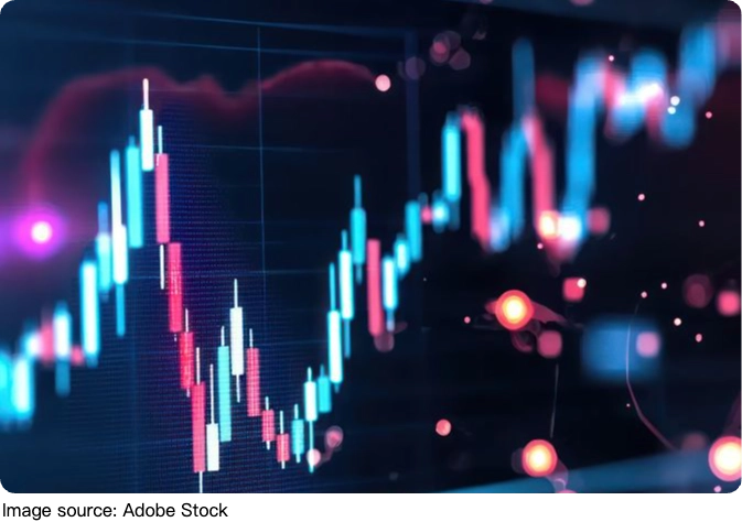
Candlestick charts are truly one of the most intuitive and time-tested tools in a trader's toolkit. They turn raw numbers into a visual story about how buyers and sellers are feeling, and that emotional layer is incredibly valuable. Just remember, they shine brightest when paired with other signals and a healthy sense of patience. Keep learning, trust the process, and know that every chart you study brings you one step closer to reading the market with confidence!
Popular
Gut Microbes And Women
Small-bowel bacteria differ between women and men, offering new clues to conditions that disproportionately affect women.
Path To Riches
Why Millionaires Think Completely Differently About Money and Success!
Smarter Business Finance
Small Businesses Are Exploding in Growth Thanks to This Financial Technology!
Diabetes Checkups Explained
What to Know About Blood Sugar Testing, Glucose Monitoring, and Doctor Visits